Chapter 3: Design Elements in Visual Merchandising
Designing an effective beverage display takes some know-how. As we talked about in the first chapter, you need to know a little bit about consumer behavior. You also need to understand how to apply visual elements such as color and contrast. The goal is to create a display that captures the eye and influences purchasing decisions. To do that, a display must be both appealing and functional.
If you look at displays in various stores, you’ll likely see bright colors and striking images. These displays are meant to stand out from their surroundings and “shout” for the customer’s attention. However, you don’t want to scare customers away with a too-loud display, either. We’re here to help you find the right balance. In this chapter, we’ll discuss the elements and principles of design to help you custom-make your beverage display.
See Our Beverage Display Solutions
Basic Merchandising Principles
As a supplier, your job may be to provide retailers with your product in a crowd-pleasing display. While you may not be responsible for rearranging products in a store or stocking shelves, it still helps to know basic merchandising principles and how retailers think. Understanding a few merchandising principles can help you form a successful relationship with a retailer and impress future business partners. Here are some of the fundamentals:
- Be tidy: Keep displays well-stocked, clean and organized. Make sure products with labels face out to create a more effortless shopping experience and neat appearance.
- Maximize use of space: Stores should have enough room for customers to move around without bumping into objects. Organize products to make the best use of space and avoid overstuffing areas with the merchandise. You want customers to notice that the area is curated.
- Consider prime areas: Place high-profit, seasonal, promotional and new items in prime display areas, such as the front of the store or the end of aisles. Impulse buys belong in checkout areas, so customers can grab products as they wait in line. However, avoid placing merchandise directly at the entrance of the store. You’ll want to save space for a “decompression zone,” which allows customers to adjust to the store’s environment.
- Send customers to the back: Place high-demand items, like bottled water and toilet paper, toward the back of the store. This directs customers to move through the entire store.
- Keep things fresh: Change endcaps frequently to keep customers engaged. Endcaps should be used to display new products, seasonal items or on-sale merchandise.
- Create groups of threes: Group related items in threes to create an attractive display and increase sales. For example, you might place tea next to teacups and biscuits. The goal is to increase add-on sales and save customers time.
- Prioritize price tags: Make sure every item has a visible price, whether on the display itself or the product’s label. Customers usually don’t want to ask store clerks how much products cost.
- Utilize signage: Retail signs are a critical part of merchandising and can be used to complement displays and point shoppers to new products. Signs can also be used to educate customers about a product or advertise sales. Retail signs may be hung from the ceiling, set on the floor, attached to a shelf or part of a display.
- Appeal to the senses: Merchandising isn’t just about visual cues. Retailers use sound, touch, smell and taste to engage customers and create memorable, multi-sensory experiences. For example, stores might play soft music to slow customers down and inspire browsing. Grocery stores may invite customers to sample certain products, which can be an effective way to encourage purchases and build brand loyalty.
The 4 Elements of Visual Merchandising
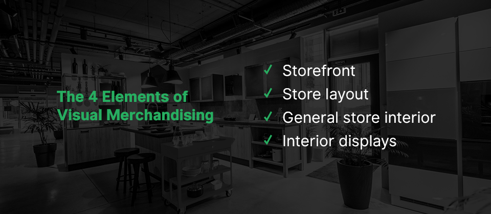
Merchandisers have a lot of space to cover when they arrange a visually appealing store. They must consider four main elements when they practice visual merchandising, which include:
- Storefront: The storefront consists of a store’s sign, banners, window displays, awnings, landscaping and overall exterior design. The storefront is meant to offer convenience and security and get customers excited to step inside.
- Store layout: Store layout is how a store uses floor space to serve customers and promote sales. Common store layouts include a grid layout and a racetrack layout.
- General store interior: The store interior includes lighting, floor and wall coverings, signage, furniture and shelving units. Retailers can apply graphics or signs to walls to promote merchandise or give customers directions and keep them from getting lost.
- Interior displays: Displays include cases, tables, counters, mannequins, props, decorations, kiosks, vignettes and various point-of-purchase displays. Displays should allow customers to select items without asking employees for assistance.
When you work with a retailer or merchandiser, you’ll need to consider visual merchandising elements to ensure you design a display that’ll complement the other features in the store.
Design Elements to Consider When Creating Beverage Displays
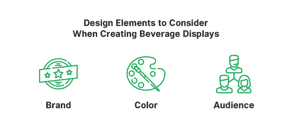
When you’re ready to design a beverage display, you’ll have to fulfill several roles. You’ll need to think like an engineer to build the display’s structure and a graphic designer to create captivating images and colors. You’ll also have to put on your marketer’s hat and think about your brand and target audience.
Overall, you have many different elements to consider when you design your beverage display. To help you start the process, let’s look at the top three aspects first:
1. Brand
Your brand is the best place to start with design ideas because you’ll want to be consistent. Look at your logo and use that to inspire the color scheme, typography, shapes and imagery you choose to be printed on your display.
Also, consider your brand’s personality, mission and values, as all of these factors should influence your design choices. Customers expect your display to reflect your brand’s identity and communicate who you are.
2. Color
Color makes customers stop and look at a display. It also helps customers make up their minds about a product. According to research, people make a subconscious judgment about a product in less than two minutes, and up to 90% of their assessment is based on color alone.
Although it’s essential that your display’s colors match your brand and the product you’re merchandising, keep in mind that various hues affect people differently. You can use these concepts to design a display that sends a particular message.
For example, past studies suggest that color impacts the perception of taste. Beverages presented in blue or green containers are perceived as having more thirst-quenching qualities than those served in red or orange containers. It’s not surprising then to see bottled water brands incorporating blues and greens in their displays.
If you want to let customers know your product has a stimulating effect, you might add high-energy colors like red, orange or yellow to your design. If you’re going to convey an eco-friendly image, choose hues taken from nature, like browns, blues and greens. Whatever colors you choose, keep in mind that bold pigments attract attention.
The color you choose will also impact the way the product appears. For example, a red product package appears more brilliant against a black background. The color scheme should enhance the product and shouldn’t alter the color of the merchandise.
3. Audience
It helps immensely to clearly define your target audience before you draft a display design. Marketers define the target audience by age, lifestyle, income and numerous other factors. Once you know your target audience in-depth, you can create displays that capture their attention and speak to their hearts and minds.
Defining your target audience usually involves market research and understanding your product well. You’ll want to be able to answer the following questions:
- What problem does your beverage solve?
- Who needs this problem solved?
- What are your customer’s dreams and goals?
- What are their values, lifestyle, personalities and interests?
- What are your customers’ demographics?
- What are they passionate about?
- How can your beverage make their lives better?
- What unique characteristics do you offer your audience?
You’ll also want to consider what information your audience needs about your product and how you’ll convey that through words or images.
Other Design Elements to Consider
There’s plenty more to think about when designing your display, from the retailer’s specifications to the theme. Although the following is not a comprehensive list of display design elements, it covers some of the basics:
- Lighting: Light draws attention to a display and is especially important if your display will have a lot of visual detail. Consider where your display will be placed in the store, and if your design will work well with the lighting available or if you’ll need to add lighting. Lighting should accent the focal point of the display.
- Balance: Balance refers to the weight of visual elements on opposite sides. Traditional or symmetrical balance gives equal weight to both sides and is easy on the eyes. Asymmetrical balance creates an image of equal weight, but objects on either side are not exactly the same. This creates a sense of excitement. You might experiment with the balance in the display’s structure and imagery until you find a look that feels right. However, if you’re designing endcaps, the North American Retail Hardware Association recommends keeping endcaps symmetrical.
- Focal point: Every display needs a focal point to capture the eye. This might be a fantastical image, witty phrase or company logo, for example. Usually, the focal point is at eye level and can be seen from a distance.
- Line: Line might refer to the outline of an image or logo or to the display’s structure. In graphic design, lines have the power to impact mood. For example, horizontal lines suggest stability, while diagonal lines convey movement. Lines do not always have to be visible but can guide the images you choose.
- Space: Space refers to the empty areas between design elements. Generally, it’s best to include room in your design and not cram too many images or words in the same space.
- Theme: Consider using a theme for your display, such as seasonal, holiday, back to school, retro, local events or nature. Themes can be an excellent way for companies to launch a new product. If you decide to choose a theme, just be sure to consider your brand and target audience.
- Harmony: Harmony describes the overall look, and each component should work together and fit the same style and mood. This keeps customers from feeling confused and allows them to focus on your product’s benefits instead.
- Contrast: Contrast means placing opposite elements together. An example of contrast is a white logo against a black background. Contrast adds interest and makes products stand out. It also makes it easier to read product details. Even though contrast quickly draws the eye, it’s important not to overdo it. Intense colors should be used to cover small areas and be balanced by softer hues. Contrast can also refer to varying shapes, sizes and textures.
- Retailer’s rules: Before you design a display, make sure you know the retailer’s requirements. For instance, CVS Health requires floor displays not to exceed 50 pounds, and the display base must not be larger than 14 inches. At Creative Displays Now, we understand major retailers’ requirements, so we can help you get a head start.
- Assembly: If possible, choose a display that’s easy to assemble. That way, if retailers decide to move your display elsewhere in the store, they can make the change quickly. You’ll also enjoy a more straightforward setup and can get your product out there fast.
- Durability: Your display needs to be durable and hold your product’s weight to be a success. Custom corrugated cardboard displays are designed to your specifications, whether you need to sell cases of beer or single-serving juice boxes.
- Ease of access: Design a display that’s easy to restock and allows customers to grab the product without issues. The design mustn’t interfere with the display’s functionality.
If you’re feeling overwhelmed by all the factors you need to consider, we’re here to help. Our team of experienced designers are ready to work with you to custom-make an unforgettable display for your beverage.