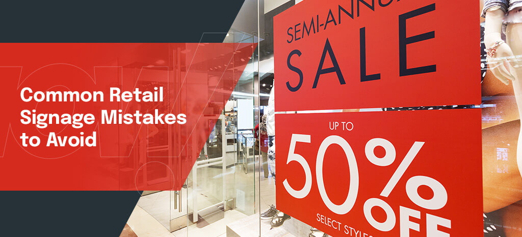
You want shoppers to notice your signage and immediately grasp a sales message about your products to convert them into loyal buyers. Signs can sometimes confuse or deter customers when created without enough thought. Many brands, from small businesses to large corporations, make small mistakes when setting up their retail signage.
Below are common retail signage mistakes and how you can avoid them to ensure your signage is effective.
1. Bad Fonts
You want your company’s sign to stand out among the competition, but it’s best to choose a font that is simple, artful and easy to read rather than the fanciest font you can come up with. Even if the font looks good on its own, consider how it will look on your completed sign with the background.
Cursive fonts are difficult for many people to read, so customers may overlook important information written in cursive. If the sign is written in an unusual font, it may garner attention, but customers will spend very limited time looking at it. You want them to be able to process your sign’s message as soon as they focus on the sign.
You should also avoid using a font that is too plain or simplistic. Certain fonts appear unprofessional when used for commercial purposes. If a font is commonly used by students, for example, you should avoid it. Find a font that will make the best overall first impression.
2. Small Lettering
Even when you choose a good font, if the lettering is too small, customers won’t be able to read the sign without squinting and straining. Most customers will pass by without focusing on what the sign says if it is too difficult to read.
Large letters make your sign visible from far away and get the message across quickly. Large lettering is also more accessible for customers with vision challenges. If you have to save space on a smaller sign, prioritize the lettering.
3. Too Much Information
Customers have a limited window to notice your sign and read the message. They will avoid reading a lot of information in an advertisement. Condense your marketing message to the most important piece of information and cut any content that seems like excess.
You want your ad to be short and easy to digest instead of an entire book. Including minimal information also makes your sign less cluttered, so the lettering can be larger and more noticeable.
4. Lettering Spaced Close Together
Your sign will appear cheaply made if the spacing is uneven or if the letters are too close together. Having access to the latest digital technology makes the process easier if you’re constructing your own sign. Otherwise, draw a grid on the sign material to ensure the lettering is even all the way to the end of the material.
Always measure before you begin working, and work off a template if possible. The worst spacing mistake happens when you run out of room to keep drawing neat lettering. Creating signage through a third party specializing in retail displays to help you avoid layman’s mistakes.
5. Outdated Information
The most economical sign is one you can reuse. If you’re using your sign to promote a sale or upcoming product release, see what information will remain relevant for another time. Go with easily adaptable information for the best results. For example, if you plan to hold a sale at a specific time of year, use the name of a holiday instead of specific dates that could differ the next year.
You can also use sign slots or a dry-erase feature where the dates can be inserted each time the sign gets displayed.
6. Awkward or Difficult to See Contrast
When choosing the color scheme for your sign, make sure it balances complementary and contrasting colors to form a visually appealing harmony. The lettering needs to contrast with the background so your customers can read it.
Creating contrast differs from clashing colors. Select a color for the lettering that stands out without looking gaudy or hurting your customers’ eyes.
7. Overly Complex Art
Your logo should be simplistic and easy to see. Customers should recognize the logo and associate it with your brand as soon as they glimpse the sign. Avoid using any image or brand asset as the logo, which needs to be universal to have the best effect. Make sure the logo conveys a symbolic message that is memorable and makes sense for your products.
8. Improper Installation
Starting your sign with a template can help you avoid making small mistakes that will look glaring once the sign is displayed. Make sure lettering is in its proper position instead of upside-down or backward. Mistakes happen when an untrained eye can’t distinguish between certain letters during the sign’s creation. For example, W and M look nearly identical when turned in the same direction.
If you order unfinished lettering for outdoor installations, make sure you prime and paint over them with a paint rated for outdoor use. Avoid drilling holes in your lettering, as holes in the finish lead to excess moisture, which could cause the letters to fall apart eventually.
9. Expensive Materials
Using overpriced materials in place of more affordable signage is a financial mistake that makes your marketing campaign needlessly expensive. Premium signage materials are often made to withstand outdoor conditions or last for a significant period of time without fading. Other materials may have an artistic effect, like paint with a patina effect to make signage look older than it is.
Select affordable, durable and stylish materials that blend with the environment where the products will be displayed. Save money on the investment by ordering reusable signage that fits your budget and will be as durable as its environment justifies.
10. Improper Overall Size
Measure the area where you want to place the signage to ensure enough room for it. Signage needs to be large enough to get noticed, but you also want to conserve floor or wall space when playing it. You want to have some negative space around the lettering so customers will have an easier time reading the sign.
When designing lettering, confirm that the height of the letters fits the average viewing distance for customers.
Get Started on Retail Signage for Your Products
Are you ready to create your signage and convert more customers? Creative Displays Now produces highly successful custom product displays of a professional quality across industries. Contact us to learn about our design and manufacturing process or if you’re ready for an estimate.


