
Color psychology is the study of how colors subtly influence human emotions, decisions and perceptions. Using colors strategically in product displays or branding can evoke specific feelings to foster connections with your brand or products to drive purchases. By understanding the psychological impact of colors, retailers can create an atmosphere that resonates with consumers to boost engagement and prompt in-store sales.
Emotions Associated With Colors
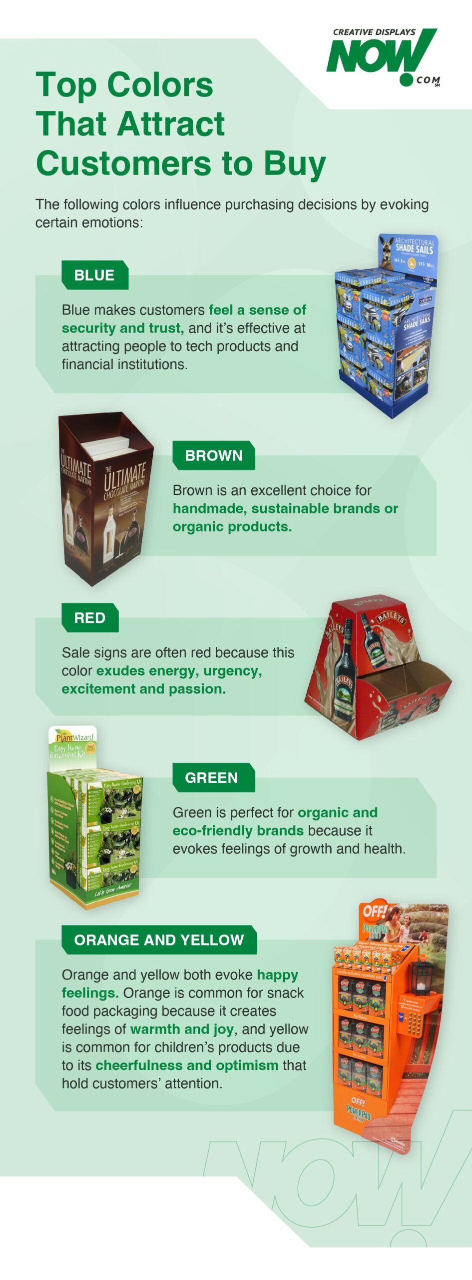
The skillful use of colors goes beyond aesthetics — and it is about much more than the idea of what colors make people want to buy. Rather, it touches the core of human disposition and profoundly influences purchasing decisions. The impact of color largely stems from the use of harmonious combinations. A contrasting black against gold accents communicates luxury and exclusivity, while a mix of pastels can elicit nostalgia and softness. Other popular colors and their connection to the consumer psyche include:
- Blue: A tranquil hue that communicates trust and security, making this a go-to choice for financial institutions and tech products.
- Brown: Brown is a calming, natural color, and using different shades of it can create a refined look for sustainable or handmade brands. It’s also excellent for brands with an organic product offering.
- Red: This color exudes energy and urgency to ignite feelings of passion and excitement, which is why you often see it on sale signs — it compels consumers to take action.
- Green: Connecting to nature, green evokes feelings of health and growth, making it a good fit for organic and eco-friendly brands.
- Orange: To create warmth, happiness and joy, orange is frequently incorporated in packaging for food items along the snack aisle.
- Yellow: This color radiates optimism, triggering warm, happy feelings. You will commonly see this hue in stores catering to children or retailers who want to promote a cheerful shopping experience that grabs and holds a customer’s attention.
Color Psychology in Marketing
One interesting aspect is how marketers work to balance these psychological triggers with the retail branding in the store. Some even demonstrate that brand-focused colors seem to trump colors used strictly to influence decision-making. Here are some examples of how some of the large retailers in the United States use color in their stores:
- Target: The strategic use of Target red for brand reasons, without over-saturating the store with the color. This still allows the red to convey energy and sale prices where necessary. Blue and yellow are also commonly used for seasonal merchandising in these stores.
- Walmart: Blue dominates the stores to enhance the brand and to create trust and security. Green is often found in grocery areas to imply freshness or natural foods.
- Best Buy: Best Buy rarely goes away from their brand colors on their point-of-purchase displays and promotions. Strong product brands seem to be the only exception. Displays that fall outside the blue really stand out in these stores.
- Home Depot: Home Depot consistently uses its branded orange color with both displays and in their permanent racking. Interestingly, their primary competitor, Lowe’s, is also very brand-color loyal, sticking primarily to blue and white as their in-store color theme.
How Retail Color Psychology Influences Purchases
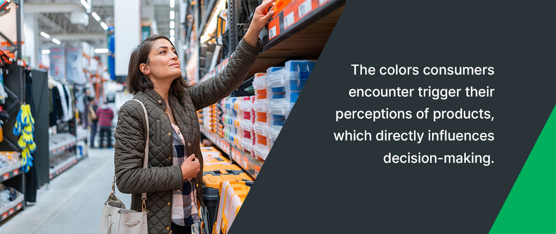
The colors consumers encounter trigger their perceptions of products, which directly influences decision-making. Three top indicators prove choosing the right colors for your product or display drives sales:
- Better performance: Colorful advertisements are read 42% more often than their monotone counterparts.
- Better brand recognition: Consistent color schemes make products stand out more, as color can increase brand recognition by 80%.
- Focuses attention: Color psychology can draw consumers’ attention to key information about products.
Get Custom Retail Displays and Packaging From Creative Displays Now
Color psychology can be a powerful tool. By harnessing the psychological impact of color on the consumer’s emotions, you can craft the experience people have with your brand. With retail displays, there is an opportunity to use brand colors in combination with complementary colors to make the display pop and engage customers. This approach is about more than good color blends — it is about communicating a consumer journey that ends in a purchase.
With over 60 years in the display and packaging industry, Creative Displays Now offers corrugated display stands and packing processes you can trust. We are a single-source service provider with an in-house manufacturing team fully equipped to design, print, manufacture and distribute premium displays. Get your free estimate from Creative Displays Now!